Hayden the PotatOS Posted July 20, 2014 Share Posted July 20, 2014 All right, let me just clear this up: Yes, I did used to charge for these, but after several complaints about my work not being worth 2 ref, I decided to take the post down. Now that I've improved (a little), I've decided to make another one. Here's one of my more recent posters PAY NO ATTENTION TO THE LINK ABOVE THIS ONE Here's how to get one: Step 1: Go into Team Fortress 2 and take a screenshot of your loadout Step 2: Upload that screenshot to imgur.com (Keep the image open in the tab, you're gonna need it later on) Step 3: Add me on Steam (If I don't accept right away, it means I'm offline/busy) Step 4: Send me the link to your screenshot. If there are any other details I have to know (Eg. Unusual Effects), or if you want a specific map/pose, just let me know. Step 5: Be patient. These posters can take anywhere from 10 minutes to 2 hours to create. Step 6: Enjoy! I will send you an image link for the poster. To download, just right click it and select "Save image as" (If you are unable to do this, I will provide you with a download link to the image) Step 7 (OPTIONAL): Pay. For the most part these posters are free, but if you do want to pay, the price is up to you. Step 8: Enjoy! You can use this poster for whatever you so desire. Avatar, background, etc... I don't mind! More Examples Link to comment Share on other sites More sharing options...
Zcrab Posted July 20, 2014 Share Posted July 20, 2014 Dat title copyright though Link to comment Share on other sites More sharing options...
Hayden the PotatOS Posted July 20, 2014 Author Share Posted July 20, 2014 Dat title copyright though It's copyrighted? God damn it. Link to comment Share on other sites More sharing options...
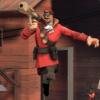
6Pix Posted July 20, 2014 Share Posted July 20, 2014 Not bad, but I have a couple suggestions. Main one: LIGHTING. Taking your example poster from above, it's a little difficult to make out the details of the Engineer. He just looks like a prop, not the focus. Lighting is a good way to fix that. Second one: Colors. In your example poster, everything is red, to some degree. It kinda blends together and to be a little blunt, it comes across as bland. Perhaps changing the spy to Blue would break it up. It's still good work, but I'd definitely look into lighting. It will take to you from good to great =) Link to comment Share on other sites More sharing options...
Hayden the PotatOS Posted July 20, 2014 Author Share Posted July 20, 2014 Not bad, but I have a couple suggestions. Main one: LIGHTING. Taking your example poster from above, it's a little difficult to make out the details of the Engineer. He just looks like a prop, not the focus. Lighting is a good way to fix that. Second one: Colors. In your example poster, everything is red, to some degree. It kinda blends together and to be a little blunt, it comes across as bland. Perhaps changing the spy to Blue would break it up. It's still good work, but I'd definitely look into lighting. It will take to you from good to great =) Got it. Will work on it immediately! Link to comment Share on other sites More sharing options...
Hayden the PotatOS Posted July 20, 2014 Author Share Posted July 20, 2014 Not bad, but I have a couple suggestions. Main one: LIGHTING. Taking your example poster from above, it's a little difficult to make out the details of the Engineer. He just looks like a prop, not the focus. Lighting is a good way to fix that. Second one: Colors. In your example poster, everything is red, to some degree. It kinda blends together and to be a little blunt, it comes across as bland. Perhaps changing the spy to Blue would break it up. It's still good work, but I'd definitely look into lighting. It will take to you from good to great =) Done. Could still be improved, but this is what I've made so far. Link to comment Share on other sites More sharing options...
Charity Posted July 20, 2014 Share Posted July 20, 2014 Done. Could still be improved, but this is what I've made so far. Already looking better than the original, great work! Link to comment Share on other sites More sharing options...
6Pix Posted July 20, 2014 Share Posted July 20, 2014 Excellent! Great job, man! Link to comment Share on other sites More sharing options...
Zcrab Posted July 20, 2014 Share Posted July 20, 2014 Put your render settings to 1024 Link to comment Share on other sites More sharing options...
Hayden the PotatOS Posted July 21, 2014 Author Share Posted July 21, 2014 Put your render settings to 1024 Mk Link to comment Share on other sites More sharing options...

Recommended Posts
Archived
This topic is now archived and is closed to further replies.